Case study / Visual Identity
Brand System for a digital product studio.
A minimal brand identity focused on clarity, rhythm, typography and a flexible visual language.
Overview
The studio needed a visual system that could move between product presentations, launch pages and editorial case stories without losing its voice.
The direction pairs restrained typography with modular image framing, simple spacing rules and a compact set of reusable layout patterns.

System
The typography scale stays intentionally direct: large page titles, clear section headings and generous paragraph text. The system avoids decorative accents and relies on contrast, pacing and image scale.
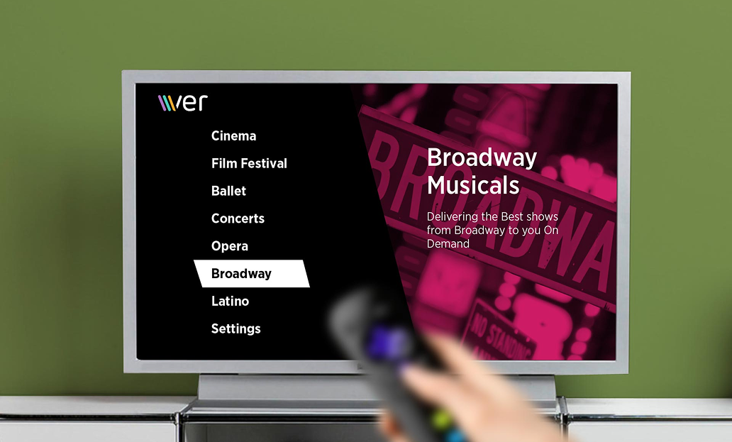
Image treatments are split into three repeatable patterns: contained image wrappers, full-width story moments and compact two-up comparisons.

Guidelines
The guidelines translate the identity into simple production rules: how images crop, where type sits, when layouts should stay quiet and when they can become more expressive.
This gives the studio a repeatable way to build new pages, decks and campaign assets without making every visual decision from scratch.
Application
The final language supports both quiet product communication and more expressive campaign moments. Each layout can scale from a single image-led story to a denser grid of product evidence.
By keeping the rules simple, the system gives every touchpoint a shared rhythm while leaving enough space for individual project personality.